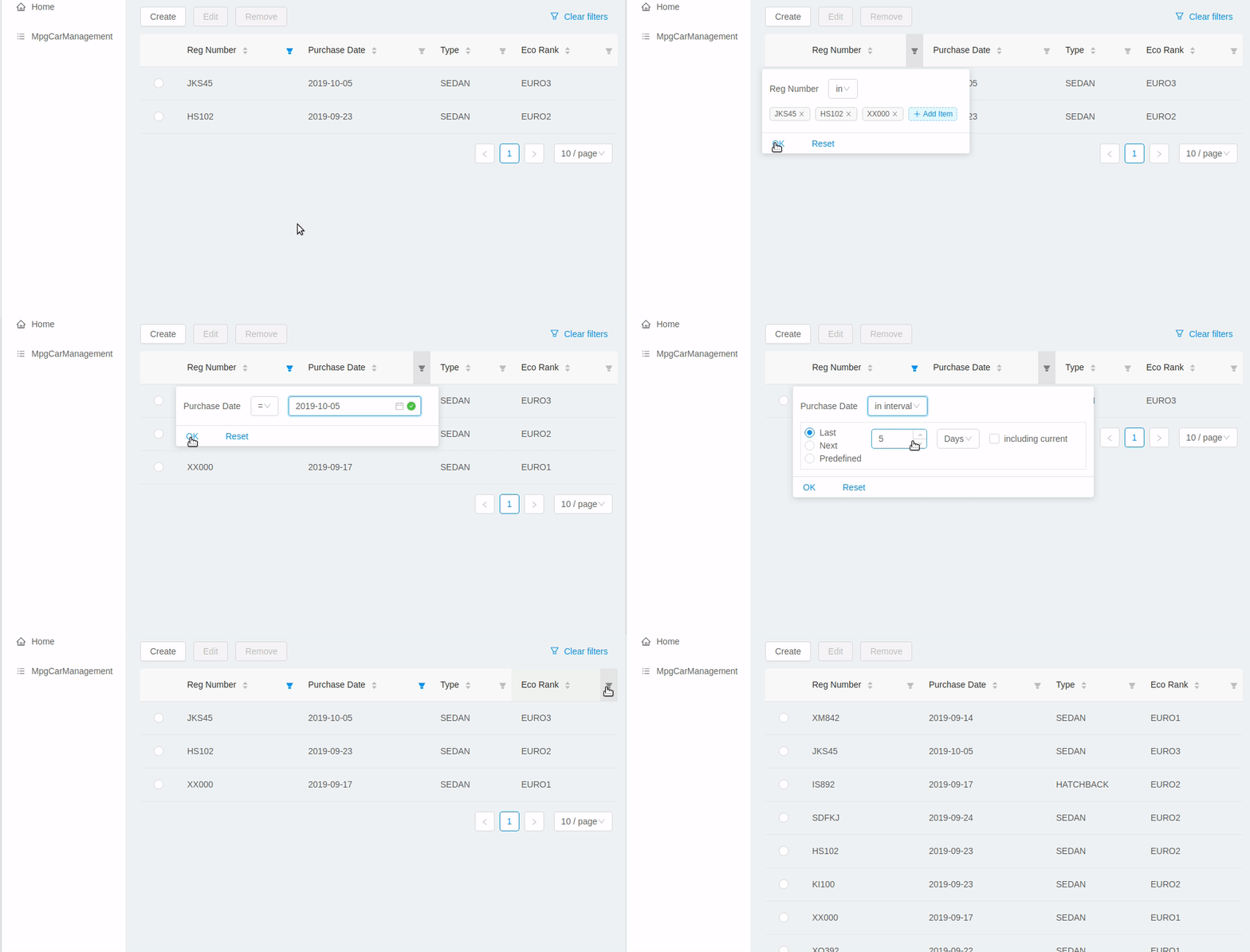
DataTable
DataTable is used to present data in tabular form.

It uses Ant Design Table under the hood and provides the following additional benefits:
-
out-of-the-box integration with
DataCollectionStore -
powerful filters
-
support for action buttons (e.g. for CRUD operations)
At the same time <DataTable> provides developer with a full access to underlying Table via its tableProps and columnDefinitions properties (see below).
Example of using <DataTable> API:
<DataTable dataCollection={this.dataCollection}
           columnDefinitions={[
             'item',
             'manufacturer',
             {
               field: 'price',
               columnProps: {
                 align: 'right'
               }
             }
           ]}
           onSelectedRowChange={this.onSelectedRowChange}
           buttons={buttons}
           tableProps={{
             bordered: true
           }}
/>-
dataCollection- instance ofDataCollectionStore. -
columnDefinitions- describes the columns to be displayed. See more details below. -
onRowSelectionChange- callback that takes the ids of the selected rows, can be used together withbuttonse.g. to facilitate CRUD operations. -
buttons- array of React elements representing the controls that will be rendered above the table. -
tableProps- can be used to override any of the underlying Table properties.
Deprecated props (use columnDefinitions instead):
-
fields- names of properties that shall be displayed. -
columnProps- can be used to override underlying Column properties. Applied to every column.
columnDefinitions is more flexible and provides greater ability to customize the columns. columnDefinitions will take precedence over fields and columnProps if used simultaneously.
|
columnDefinitions
columnDefinitions describes the columns to be displayed. The columns can represent entity properties or have arbitrary content (for example: an action button column, a calculated field column).
There are 3 ways you can define a column:
-
Simply put an entity property name as a
string. In this caseDataTablewill render a column with default settings for that property.<DataTable dataCollection={this.dataCollection} columnDefinitions={[ 'manufacturer', // more columns ]} /> -
If you want to customize the default column, use a
ColumnDefinitionobject wherefieldis an entity property name andcolumnPropsis an Ant Design ColumnProps object. The properties you put incolumnPropswill override the default properties.<DataTable dataCollection={this.dataCollection} columnDefinitions={[ { field: 'manufacturer', // property name columnProps: { // Ant Design ColumnProps object align: 'right' } }, // more columns ]} /> -
If you want a column not bound to an entity field, create it from scratch using
columnPropsand do not specify afield.<DataTable dataCollection={this.dataCollection} columnDefinitions={[ { columnProps: { // Ant Design ColumnProps object render: (text, record) => { /* render some custom content */ } } }, // more columns ]} />